What we'll want to see (eventually...) is whether this distribution is flatter than the one that describes post-season frequency for all games. One of the historical precepts about "great teams" is that they win a lot more non-close games than they do close games; but what's happened over the past fifty years is that there are fewer great teams and there are more teams that make it to the post-season. Competitive balance may be shifting the range of strategies for reaching the post-season.

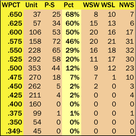
The chart shows a flattened upper region for post-season teams and their performance in close games, with the big breakpoint coming between .575 (46%) and .550 (29%). The rest of the chart looks pretty classically asymptotic. (It's interesting to note that the first team to reach the post-season while playing less than .400 ball in close games occurred just this past year: the '12 Cards.)
We'll look into the deviation from overall WPCT and WPCT in close games in future installments, but we can look at the shape difference in the descent curve for close game WPCT and overall WPCT.
When we do that, we see that overall WPCT tracks more tightly with "great teams"--but some of this is based on the fact that the first sixty years of this data represents a situation where only pennant winners made it to the post-season.

It's counterintuitive to say the least, but the close game WPCTs have a bias built in from one-run games, which don't break cleanly in terms of home field advantage. (We covered this phenomenon about ten years ago: one-run games produce a .612 WPCT at home, while all other run differentials produce only a .511 WPCT at home.) That "bias" creates most of the variation in Pythagorean Winning Percentage, and the places where it shows the most difference is a product of how that bias operates. It shouldn't be surprising to discover that the places where the distribution is more closely aligned (in the .550-.600 range) is precisely where we are seeing greater numbers of post-season winning percentages. Over time, with the division structure and an escalating wild card, the two distributions will slowly converge.
What we're going to see (in a future installment) is that the structural changes imposed by division play and wild card seem to creating a new strategic component for making the post-season--namely, by tailoring a ballclub to excel in close games. One of our charts in part 2 (the one displaying the top 25 teams in close game WPCT in inverse chronological order) shows that there's been a clustering of these type of teams in the past decade. We'll look at that in more detail next time.