 |
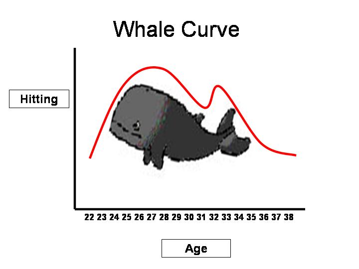
| Dept of digression dept.: If (IF...) they had a fully-fledged academic component to sabermetrics, one question that might (MIGHT...) appear on your pop quiz is: "Discuss the pros/cons of the Whale Curve." OK, then...go for it!! |
One of the long-time (meaning since we've had them readily available...) "stat splits" for team performance is its record in "low-scoring games". That category has, so far as we can recall, always been quantified as "games where the total runs scored by both teams adds up to six or less." So that's where we'll start in pursuing a "topographical" perspective on the change in offense.
Usually these splits focus on team performance, but we can also use them to look at facets of overall run-scoring performance. In this instance: what's the percentage of games where both teams combine to score six runs or less? Our modeling friends would want us to mention that you can devise a formula to predict this based on overall run scoring levels; while that's true, the upshot is that those models don't actually predict when run scoring levels will change...what we're after here is a snapshot of that change as it's occurred, with the hope that the visual display will provide historical context.
So...here's the chart, spanning 1901 to the current fledgling results in 2012.

As you can see, 2012 is clearly shaping up to be another step in pitcher ascendancy, with the shift from 2007 (25% of all games were low-scoring) to 2012 (currently just under 37%) representing the most dramatic shift in recent memory.
But "recent memory" is exactly what we are trying to transcend with this chart, which shows how the changes in offensive levels are reflected in the type of individual games we watch. That's a texture which tends to get filtered out when we choose more summarizing stats like runs/game.
Our rate of change in five years is dramatic enough now for us to take notice of it, but few if any of us will remember how sudden an even more dramatic drop in low scoring games occurred when we first moved into what Eric Walker (not Walt Davis!) coined "the sillyball era."
The chart also shows that we are nowhere near the low run scoring levels (as reflected in the higher percentage of low-scoring games) that we find in the deadball era (clustered around 1907-09 and 1916-17) and in the late 60s (clustering in 1967-68). For the moment, at least, we seem to be headed in that direction--but the value of the chart is to show that low-scoring games (as with average levels of run scoring) have fluctuated a lot more in the past that was the case from 1994-2009.
Before we push on, there's one more aspect of this that's worth discussing, and that's the psychological effect created about the "nature" or "essence" of the game as fans react to the change. Our gut tells us that it's the extreme events that tend to drive such perceptions, and we'll leave with an example that would purport to demonstrate that idea. The most extreme game is the one in which only one run is scored. That singularity is doubly impressive, and the frequency (or perceived frequency) of such games is probably more determinant of how the battle between pitcher and hitter is balanced to even a deep-fried analyst when they encounter the daily box scores.
It's surely that way for the more casual follower, who's likely to camp around the water cooler or the barstool with a rejoinder on the order of "Man, sure seem to be a lot of 1-0 games these days...there's been a bunch of 'em lately. Didn't use to see that, y'know?".
 Well--sure, man. But what's the percentage of those games? And what percentage is likely to elicit such a response? That's what the graph at right tries to combine into its simple display of the percentage of 1-0 games per year since 1901. Our conjecture is that at about 2% (where the grey shading begins), these games start to enter into the minds of fans (and even analysts). When it gets over 3% (where our black line kicks in..), it starts to become a dominant topic of conversation.
You can see where we are right now in 2012 (just under 4%--a figure that, if it holds up, would be more than double what it was five years ago). And, if you go along with the analogy, you can see why you (and many others) are starting to talk about it.